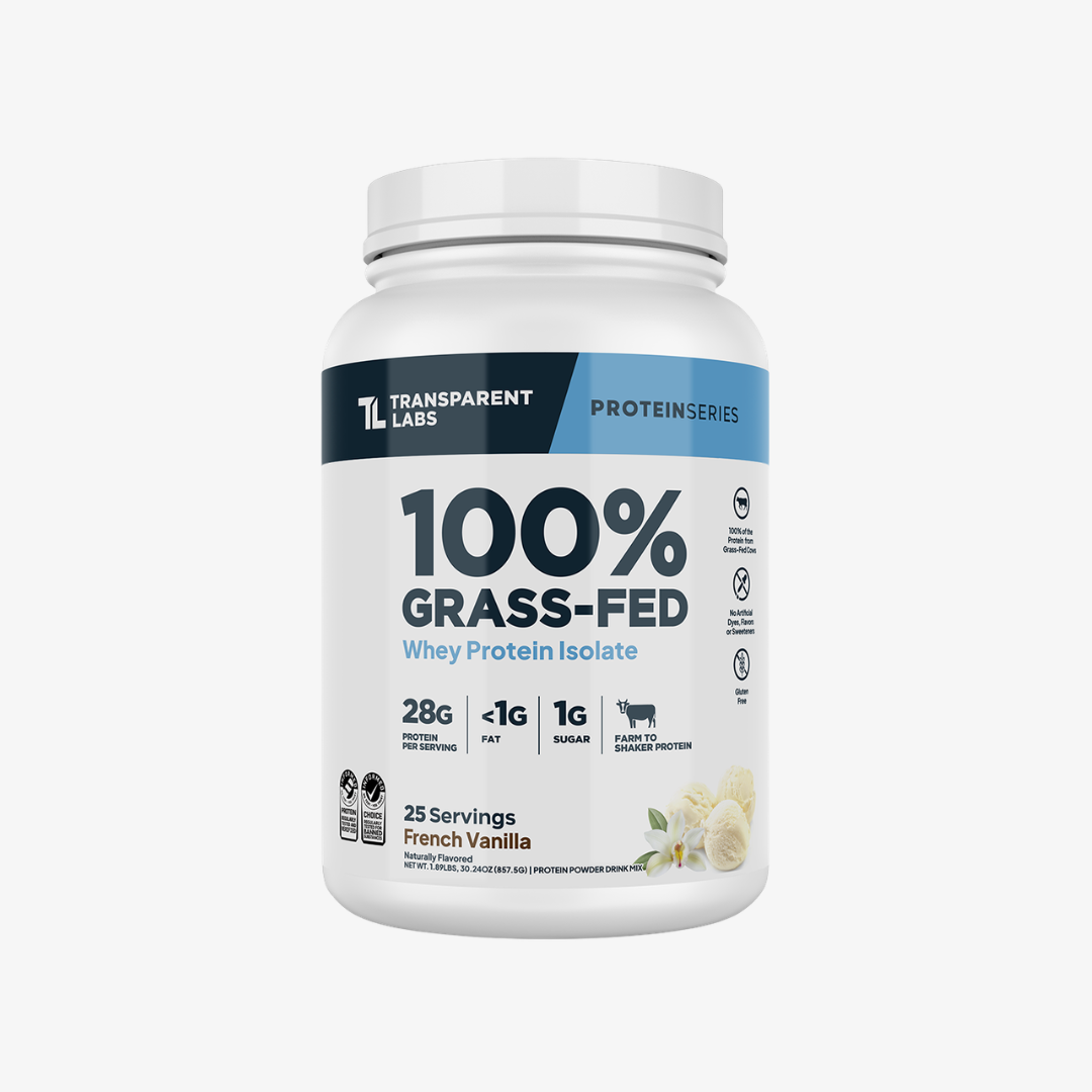
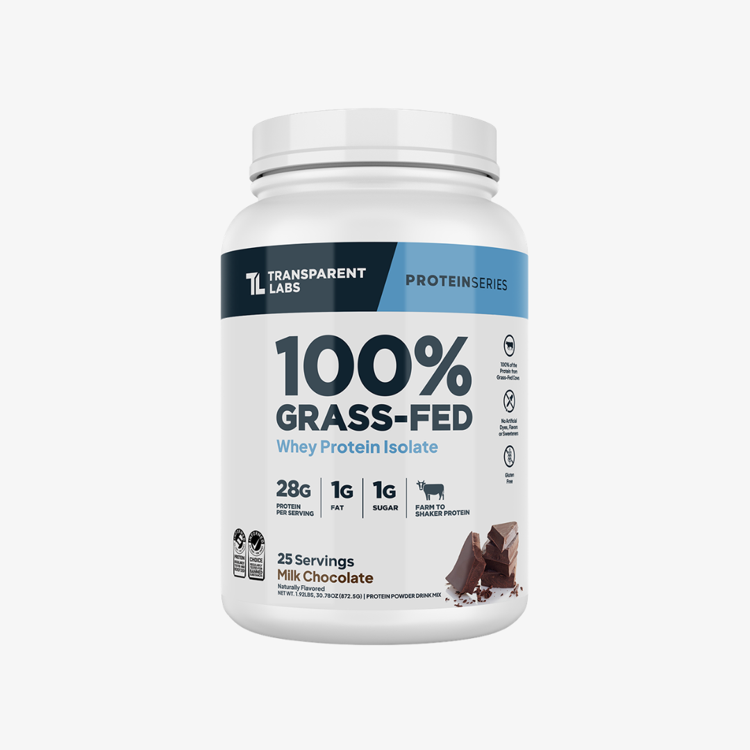
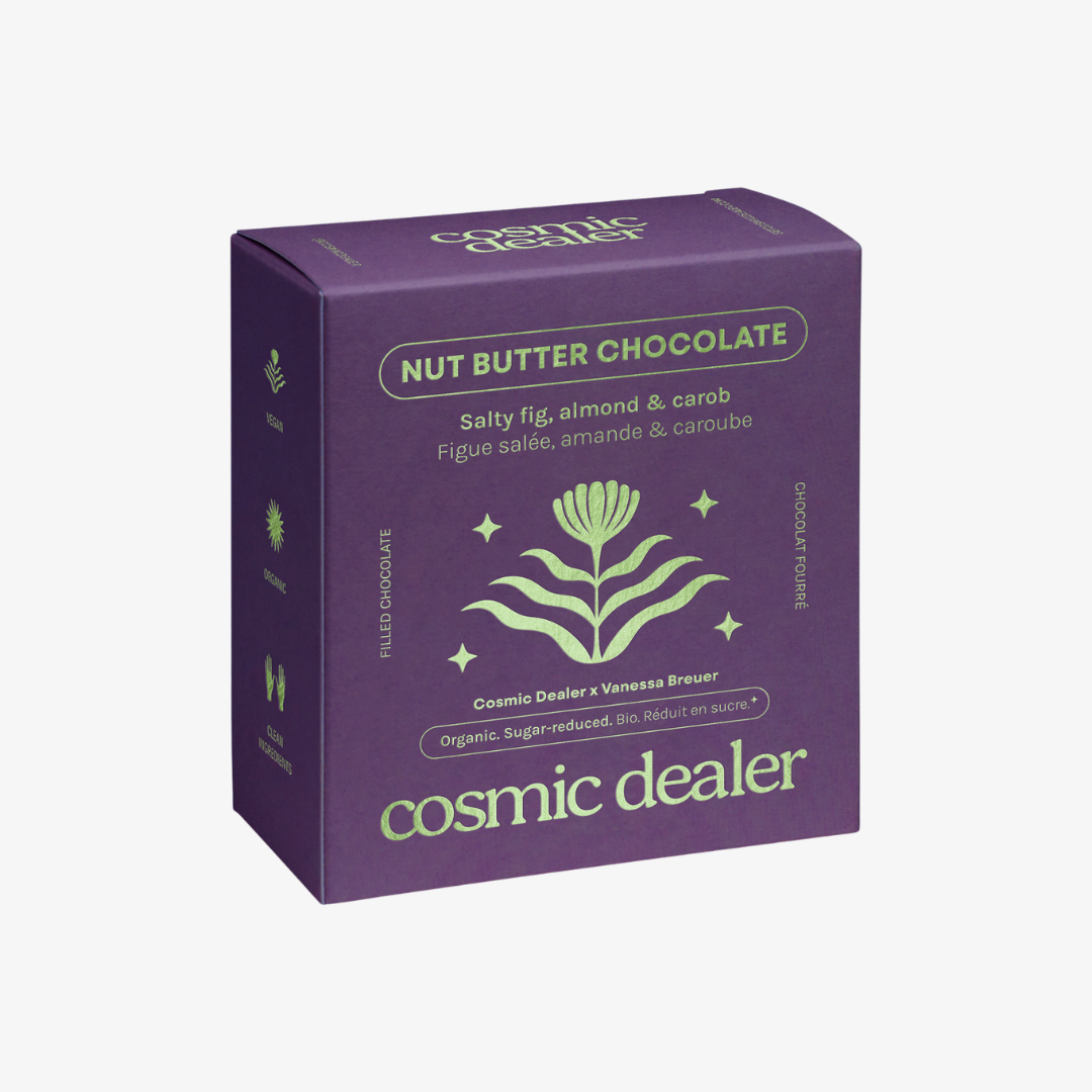
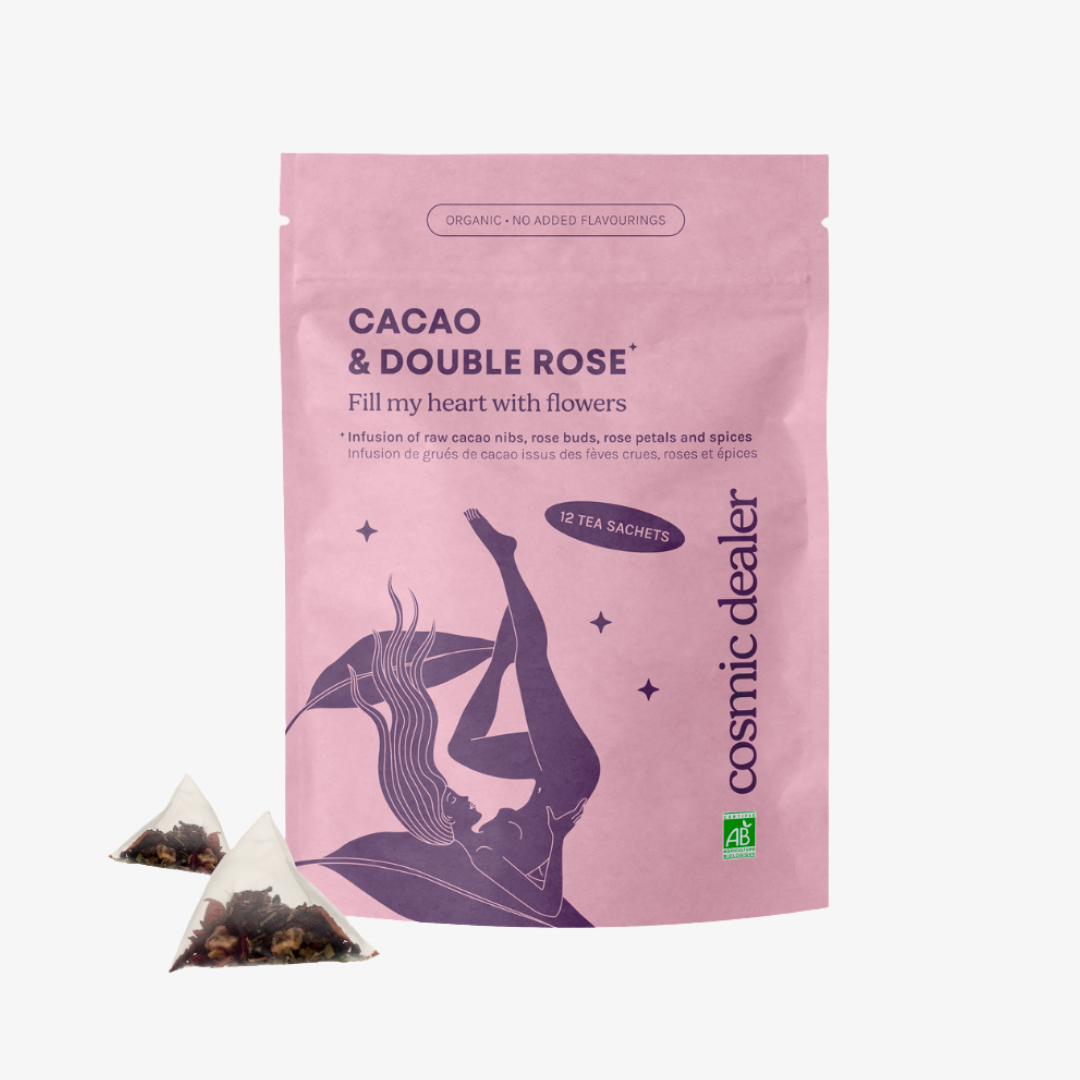
Card one
tagsrender as pills
The description is required on this block — a card without one is a tile, and tileGrid already does tiles.
Card linkBlock reference
The pinned page lead. Only ever the FIRST block: the renderer gives a leading videoHero a fixed parallax layer the page scrolls over, which is also why it's the one block a grid cell can't hold. video.desktopUrl is required — a phone gets mobileUrl or the poster, never the desktop encode. `height` picks how much of the screen it fills (full / tall = 90% / medium = 75%) and `position` is the full 3x3 grid; this one is `center-right` at `tall`, which is healf.de's masthead. A right-positioned block keeps LEFT-aligned text unless `textAlign` overrides it.
One rendered example of every block the page builder offers, generated by apps/cms/src/scripts/seed-sink-page.ts. Editing this page by hand is pointless — the next run overwrites it.
Each heading names the block's slug and the settings used to compose it, so you can find the same values in the admin. Where a setting changes the layout enough to matter, the variants appear next to each other: tileGrid three ways, grid two ways, pillList two ways.
This block is richText — a Lexical field with no settings at all. It renders as a centred reading column.

Tall renders the background at its natural height with the title centred over it; the scrim darkens the photo and forces white text so any image stays legible.
Block reference
01 variant: left02 size: standard03 metaItems replace the description
Healf Expert
The live curation-expert header. Pills sit BETWEEN the name and this paragraph, the column narrows to 660px and centres, and unlike every other hero the description still prints alongside the meta items. Everything else about the block is unchanged — it is the same hero, wearing its third shape.
Above: grid — columns: 2, holding two collectionCard children. This is the homepage's pattern, used twice there. The grid owns layout, the children own content; children render 'nested', dropping their own page gutters so they fill the cell instead of re-containing themselves.
Above: grid — columns: 4, theme: dark, holding four collectionCard children. The /pages/brands wall is this exact shape with twenty-six of them. collectionCard is the only block that exists solely to live in a grid — it's absent from the top-level block list, so a grid is the only place you can reach it.
Nothing on the image; label and optional description sit below it. The expert grid on /pages/curation is this. Setting `number` switches the heading to the small-index treatment you see to the left.

Rose Ferguson
description renders under the label

Tara Swart

Jamie Clements

Matt Maruca
Near-square image with the label top-left and chevron bottom-right, then the caption and a pill button below it. The button only appears when a tile sets ctaLabel — the other two styles ignore that field. These are the Zone/Source/Curation cards on /pages/about-us.
Block reference
An editorial card set: each card takes an image, a title, a tag row and a required description. Unlike tileGrid the cards are content-shaped rather than a photo wall, and each carries its own link CTA.
The description is required on this block — a card without one is a tile, and tileGrid already does tiles.
Card link
Cards keep their aspect ratio across breakpoints.

Three is the usual count; the grid reflows to two-up then one-up as the viewport narrows.
A horizontally scrolling row. Overlay uses a square image with the title on top of it; the sibling setting `caption` gives a 2:3 image with title and description below instead.
“Dots auto-rotate; the `tabs` setting instead renders a manual tab row using each slide's tabLabel.”
“Slides carry an image, a category, a name and role, the quote itself and an optional description and CTA.”
Rose Ferguson
“With autoplay off, dots become manual paging — the two settings are independent.”
Tara Swart
The heading sticks while the cards scroll past it. Tall gives each item a numbered 2:3 image with title and description below; `horizontal` instead lays each item out image-left, text-right.
Block reference
`number` is per item, so the sequence is yours to set.
An item with an href becomes a link.
The heading stays put until the last card clears it.
Media is optional per item, which is the difference from cardGrid: steps are a sequence, so they read fine as text alone.
Items render in order with their index shown.

An image per step is optional.

This step has no media at all — the row still balances.
The layout live uses for the curation experts' non-negotiables band. Numbering is dropped on purpose: at 2-4 columns the items are a SET, not a sequence, so an ordinal would assert an order that isn't there. One column on phones, two from md, the full count from lg.
Item headings step up to 24px here.
No weight utility — live computes 400.
Media is optional in this variant too.
This one has an image, to show the row still aligns.
Rated 4.8 (Excellent) based on 14,300+ reviews on Trustpilot
Reviewer name
Reviews scroll as a marquee
The card strip duplicates itself so the loop is seamless, and pauses on hover. With bgImage set the cards go glassy over the photo; without it they sit on the theme surface.
Second reviewer
The rating line is three-tiered
Live per-market Trustpilot score first, then this block's ratingText, then the legacy static line from Reviewee — so a market never shows another market's numbers.
Reviewer name
Reviews scroll as a marquee
The card strip duplicates itself so the loop is seamless, and pauses on hover. With bgImage set the cards go glassy over the photo; without it they sit on the theme surface.
Second reviewer
The rating line is three-tiered
Live per-market Trustpilot score first, then this block's ratingText, then the legacy static line from Reviewee — so a market never shows another market's numbers.
Block reference
A single full-width promotional band. Unticking `enabled` hides it without deleting it, which is how a campaign is parked between runs.

A media half beside a numbered display heading and body copy, sitting directly on the section surface with no card. The editorial sibling of collectionSpotlight, which puts its text on a cream card and can append a product row.
Blank lines in the body become separate paragraphs, as here. Because this block has TWO media entries it renders as a fading carousel with prev/next arrows — a single entry renders a static image instead.
Value and label per entry, nothing else. Deliberately text-only: it's a rhythm break between two image-heavy bands.








A cream/ink card beside an image, plus an optional product row underneath drawn from `source` — bestsellers here. splitFeature above is the same split without the card or the products.
627 results
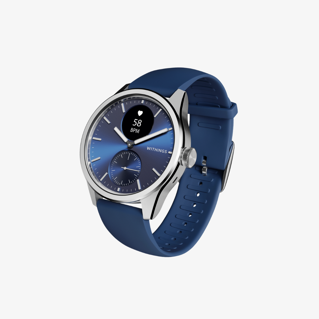


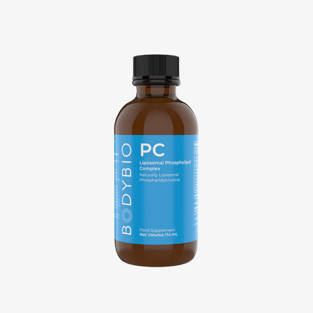



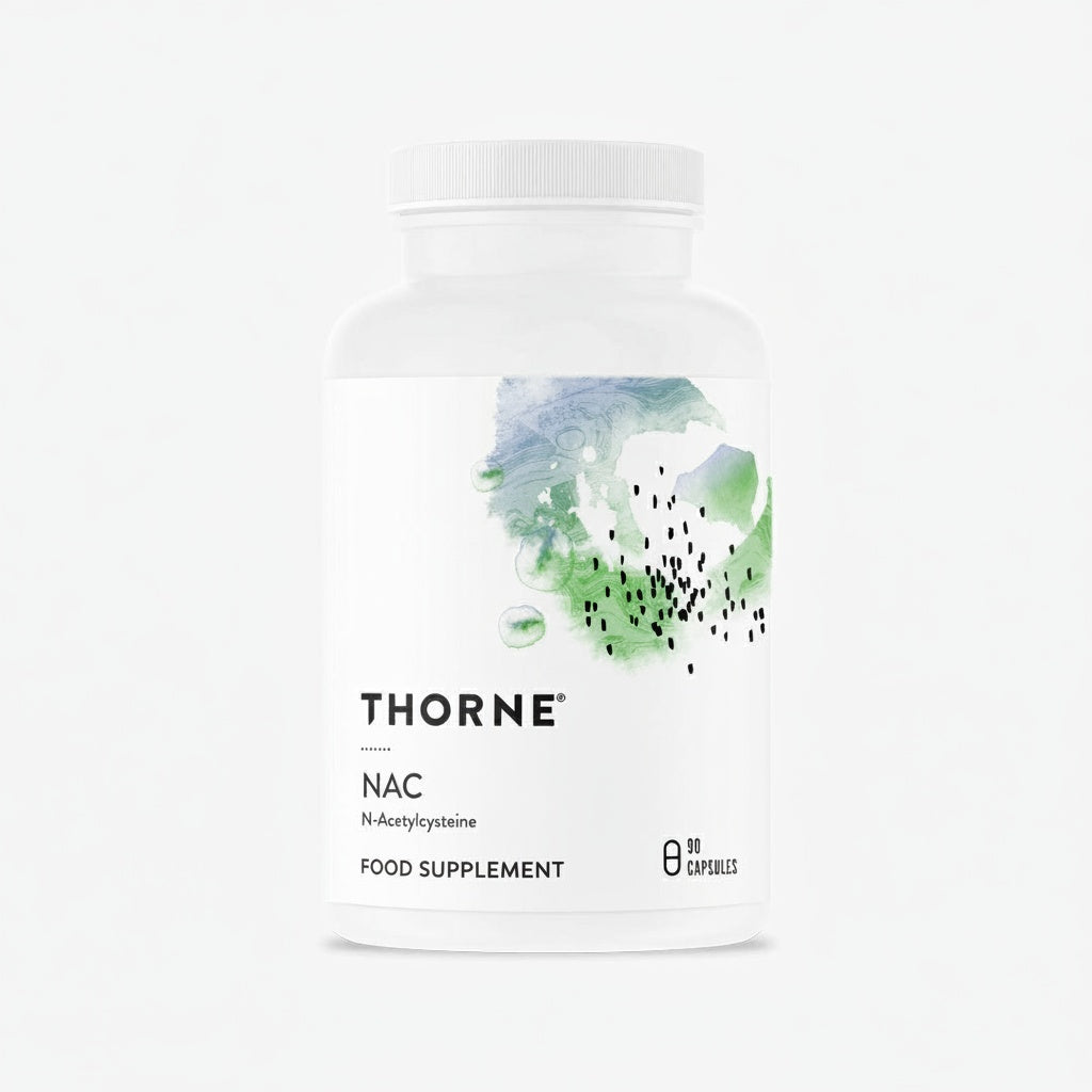

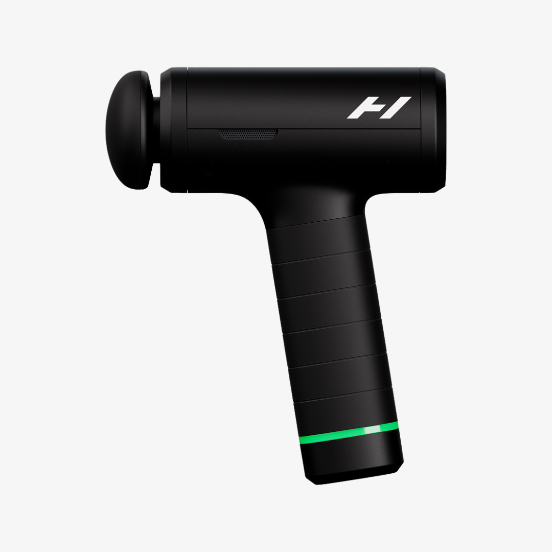
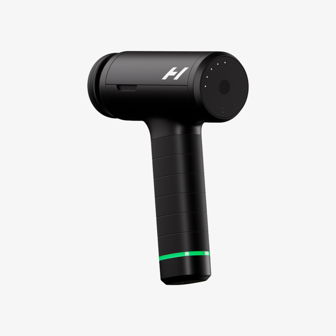


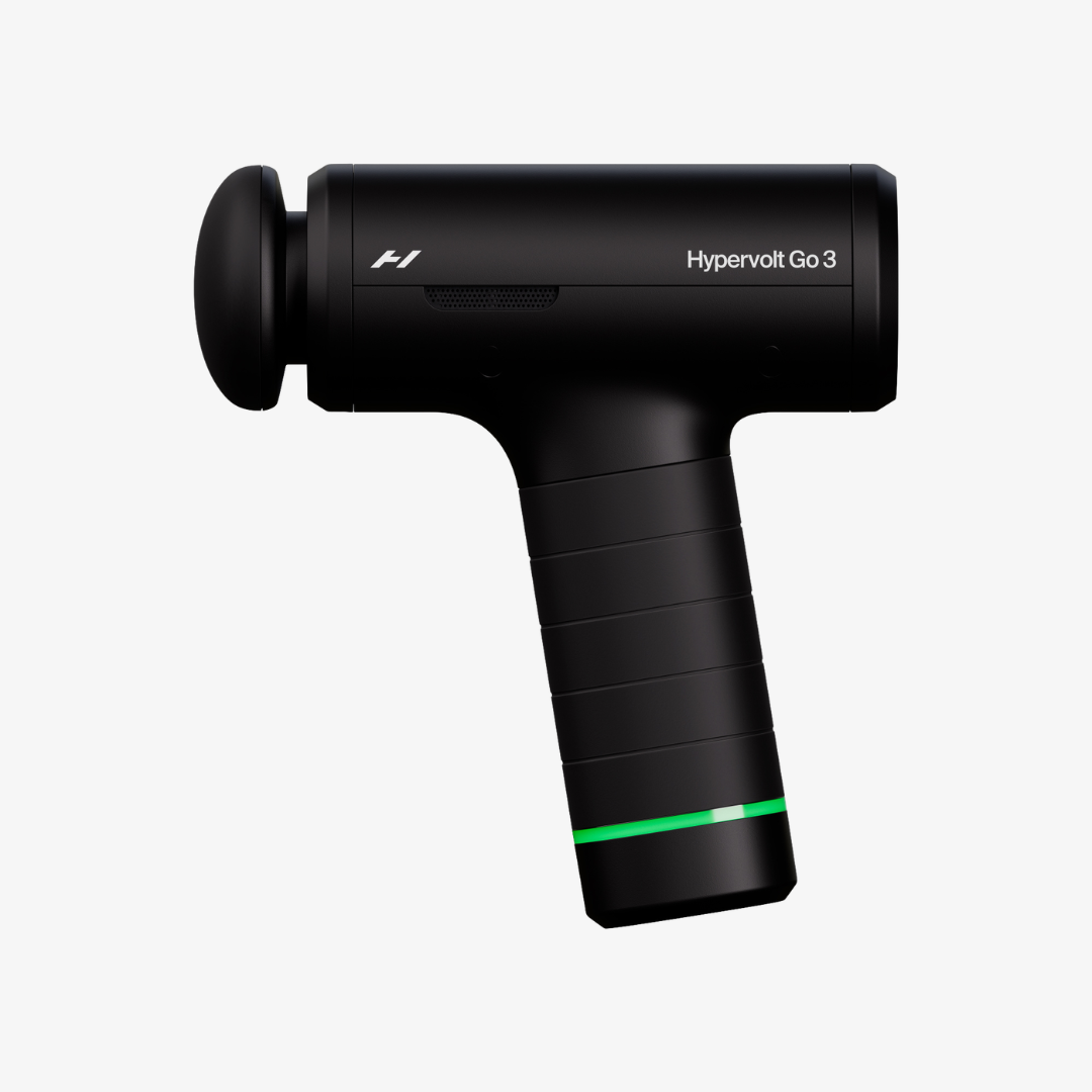


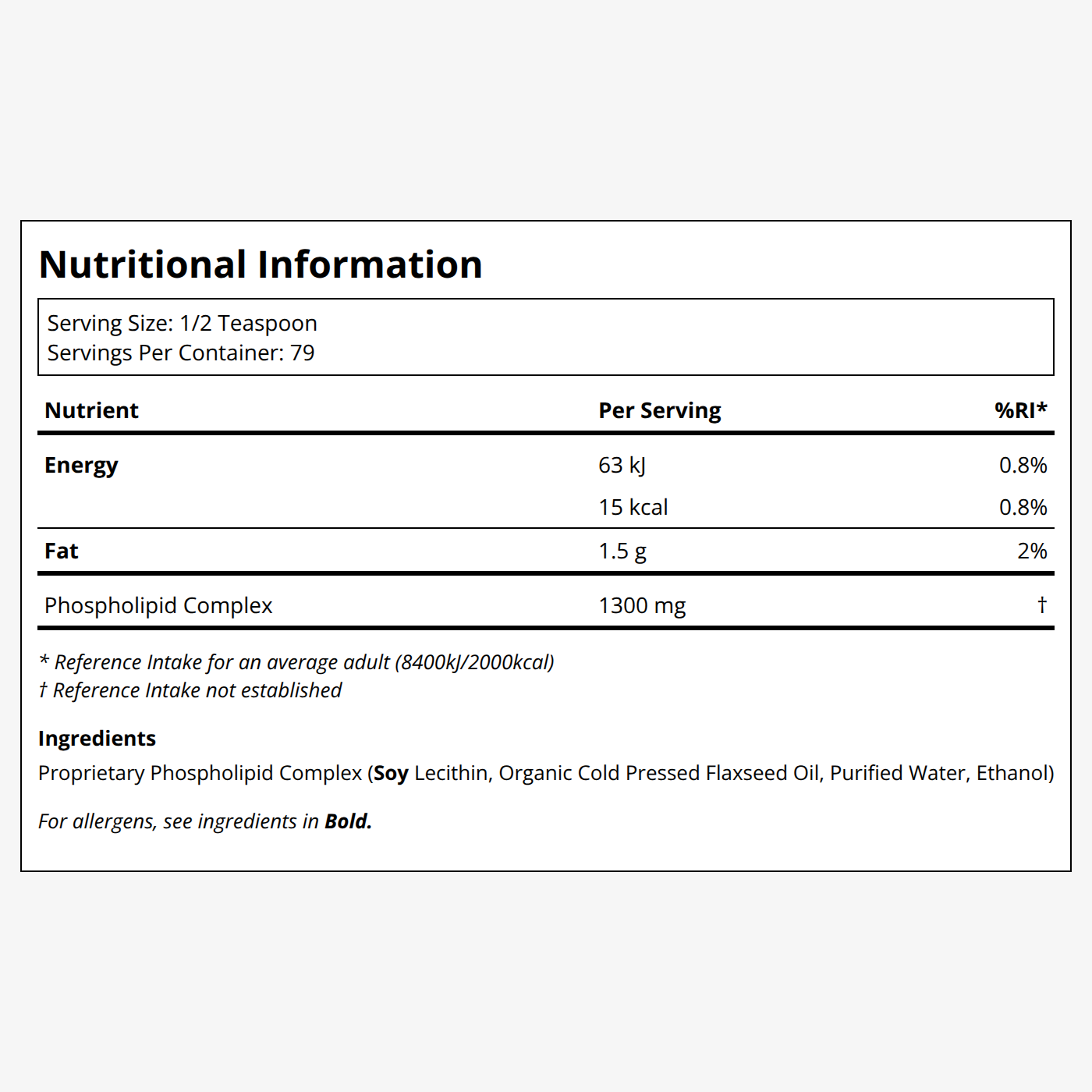
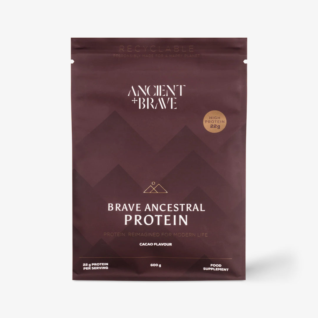



The founder of DAYE isn't just interested in period care. She wants to completely change the way we approach health and wellbeing for women.
Read more-3.jpg)
From dehydration and migraines to muscle tension and caffeine withdrawal, a GP and nutritionist explain what different headaches feel like, why they happen, and the evidence-backed ways to relieve them without popping painkillers.
Read more
Here's exactly how the legendary music producer finds inner peace using Transcendental Meditation.
Read moreScrollable link pills with chevron nav that only appears once the row actually overflows. Each pill can carry an href.
The same block as decoration: two auto-scrolling, edge-faded rows, centred title and intro. Hrefs are ignored here — the /pages/curation ingredients band is this variant.
Collapsible rows with Lexical bodies, so an answer can hold links and lists. `full` instead spans the band, which is what the Help Centre FAQ uses.
Narrow keeps a reading column, which suits a short FAQ beside other content. Full spans the band for a long, standalone list.
Block reference
The Help Centre tabs and accordion over the shared faqs collection. Leaving categories empty shows every tab, which is the usual choice; naming some limits it, and a chosen tab with no questions in the visitor's market is dropped rather than shown empty.
No FAQs available just yet. Head to Contact us and we'll be happy to help.
The in-page shipment timeline. Every visible string is an override on the block (loginLabel, searchPlaceholder, emptyText, notFoundText) so the copy can be tuned per market without touching code. Which Wonderment account it queries is a market fact, not a block setting.
Block reference
Thin by design: the CMS owns the lead-in copy, the form's own field labels come from Reviewee, and the submission target is wired in code. Nothing here to misconfigure.
The submit-your-brand form. Note the theme setting styles the PANEL, because the background image sets the band's contrast — a background-less brand form also declines the LCP slot for the same reason.
`attachments` toggles the file field. The labels group holds optional per-locale overrides for placeholders, buttons and result messages; each falls back to Reviewee, then to a built-in default.
logoMarquee — label beside an auto-scrolling logo strip
Above: logoMarquee — the press strip from /pages/about-us. Each logo's accessible name is its media alt text, so there's no per-row label field. SVGs render as plain images rather than through the transform pipeline, which does nothing for vector art.
Scroll-driven



Above: scrollSequence — a pinned frame sequence. `markerStyle: dial` draws a clock whose numerals stay upright while the rim turns, and it only appears when EVERY frame's marker parses as a time; anything else falls back to plain progress segments. Markers are rarely evenly spaced, so the dial emits one keyframe stop per frame rather than tweening end to end — a single tween would read 15:00 while frame two says 18:00. `revealOnEntry` opens the stage from an inset card; the stage keeps a margin and a 24px radius throughout, matching live.
pillarStepper — labels that hand over as you scroll
Each step's copy fades in as its label reaches the centre. The band is short on purpose — live's is 324px, about 0.41vh — which is why this is its own block rather than a scrollSequence variant.
Consecutive steps never overlap: the copy fades out over the last fraction of its slice and the next fades in over the first, so no two are ever printed on top of each other.
Zero JavaScript. The whole thing is `animation-timeline` on a shared ancestor, which is why both columns can be driven by one timeline.
Any number of steps works; the keyframes are generated from the count.
arcCarousel — sweep: 80
Above: arcCarousel — the same circle mechanic as the dial, WITHOUT the counter-rotation, which is the entire visual difference: the cards look hand-tilted but each just sits on the rim at `index x angleStep`. `sweep` is how far the rim turns across the pinned scroll. Products come from the shared picker (hand-picked SKUs win) or a collection, resolved through the same path as productGrid; hand-authored cards are the fallback so the rim can carry brands or editorial instead.
Above: productTabs — several named sets, shopper's choice. Not a productGrid variant: a productGrid shows one set, so the tab labels here are translated CONTENT rather than a layout option. A tab whose products don't resolve is dropped rather than rendered as a dead label, and a single surviving tab renders as a plain grid with no strip — which is what you are looking at if only one tab appears. `<product-tabs>` only toggles visibility and ARIA state; it never fetches.
Above: videoWall — one markup, two layouts: a grid on desktop and a scroll-snap row on narrow screens, rather than legacy's second carousel component below the breakpoint. `<video-wall>` is the only script and it animates nothing — it plays a video only while it is on screen and allows at most one unmuted at a time. As everywhere else, a phone gets `mobileUrl` or the poster alone, never the desktop encode.
That's every block. If a block is missing from this page, it's missing from seed-sink-page.ts — add it there and re-run.